Distributions
Distribution charts answer where observations lie, how widely they vary, and whether groups differ in shape or rank. The right encoding depends on whether the reader needs familiar bins, compact summaries, cumulative probability, or the detailed shape of each group.
Choose the comparison
| Reader question | Start with |
|---|---|
| How often do values fall within fixed ranges? | Histogram |
| How do center, spread, and outliers compare across groups? | Boxplot |
| What proportion of observations is at or below each value? | Empirical cumulative distribution |
| How do several binned profiles compare in limited space? | Ridgeline |
| How do several mirrored distribution profiles compare? | Violin |
| Must every observation remain visible? | A beeswarm or strip layout |
Binning, standalone quantiles, and density estimation are data preparation. boxX and boxY own their complete Tukey summaries because independently prepared quartiles, fences, whiskers, and outliers can drift. Dot collision placement belongs to the chart because it depends on final scales, plot bounds, and pixel radii.
Preserve observations with a beeswarm
Use a dodge layout when every observation should remain visible without moving its measured coordinate.
dot(rows, {
  x: 'economy (mpg)',
  key: 'id',
  r: 4,
  layout: dodgeY({ anchor: 'middle', padding: 1 }),
})
The Dodge Layouts reference covers anchors, variable radii, identity, and facets.
Inspect frequency with a histogram
A histogram groups quantitative observations into intervals. Keep thresholds stable when comparing revisions or groups; otherwise a changed binning decision can look like a changed distribution.
import { binX, defineChart, rect } from '@tanstack/charts'
import { scaleLinear } from '@tanstack/charts/scales/linear'

const responseTimes = [
  82, 91, 96, 103, 108, 112, 118, 121, 127, 131, 138, 144, 149, 153, 162, 171,
  184, 196,
]

const bins = binX(responseTimes, {
  value: (datum) => datum,
  thresholds: [80, 100, 120, 140, 160, 180, 200],
  outputs: { count: { reduce: 'count' } },
})

const chart = defineChart({
  marks: [
    rect(bins, {
      x1: 'x1',
      x2: 'x2',
      y1: () => 0,
      y2: 'count',
      inset: 1,
      fill: '#2563eb',
    }),
  ],
  scales: {
    x: { scale: scaleLinear, axis: { label: 'Response time (ms)' } },
    y: { scale: scaleLinear, grid: true, axis: { label: 'Requests' } },
  },
})

export default chart
Open the catalog histogram for the complete vehicle dataset and update behavior.
The prepared rows should carry each bin's lower bound, upper bound, and count or proportion. Render those intervals with Bar and Rect Marks. The Scales explains how the application chooses thresholds and reductions.
Compare compact summaries
A boxplot summarizes quartiles, a median, whiskers, and optional outliers. It is compact and comparable, but it does not reveal modes, gaps, or sample size on its own.
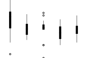
Pass the raw observations to boxY, or use boxX for horizontal boxes:
boxY(morley, {
  x: 'Expt',
  y: 'Speed',
  key: 'Run',
  fill: '#bfdbfe',
  stroke: '#2563eb',
})
The mark owns quartiles, 1.5-IQR Tukey fences, observed whiskers, outlier partitioning, and direct source lineage. Its tooltip datum discriminates kind: 'summary' from kind: 'outlier'. The Box Marks reference documents the exact statistics, styling, and interaction targets.
Preserve every rank with an ECDF
An empirical cumulative distribution shows the proportion of observations at or below each observed value. It avoids bin-width decisions and supports direct percentile comparisons.

Use a step curve because the empirical proportion changes at observations, not continuously between them. State whether ties share a rank and format the vertical axis as a proportion.
Compare binned profiles
Use a ridgeline when several prepared profiles need a shared quantitative axis and compact categorical baselines.
const profiles = normalize(
  binX(episodes, {
    value: 'imdb_rating',
    by: 'season',
    thresholds: ratingBoundaries,
    outputs: { count: { reduce: 'count' } },
  }),
  {
    value: 'count',
    by: 'season',
    basis: 'max',
    as: 'height',
  },
)

ridgelineY(profiles, {
  x: 'x',
  y: 'season',
  height: 'height',
  overlap: 0.78,
  color: 'season',
})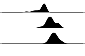
binX retains the episodes in each bin, normalize retains each bin as its immediate source, and ridgelineY owns only the responsive category-step offset. This example is a normalized histogram profile, not a kernel density estimate. The Ridgeline Marks reference documents overlap, category scales, curves, and interaction.
Compare detailed group shapes
A violin mirrors a prepared normalized profile around each category. It can show modes and shape that a boxplot hides. Its interpretation still depends on the authored bins or density estimator.
const profiles = normalize(
  binY(observations, {
    value: 'body_mass_g',
    by: 'species',
    thresholds: massBoundaries,
    outputs: { count: { reduce: 'count' } },
  }),
  {
    value: 'count',
    by: 'species',
    basis: 'max',
    as: 'width',
  },
)
const summaries = groupBy(observations, {
  by: 'species',
  outputs: {
    median: { value: 'body_mass_g', reduce: median },
  },
})

violinY(profiles, {
  x: 'species',
  y: 'y',
  width: 'width',
  span: 0.76,
  color: 'species',
  curve: d3AreaXCurve(curveBasis),
})
tickY(summaries, { x: 'species', y: 'median', span: 0.36 })
dot(summaries, { x: 'species', y: 'median' })
violinY owns only mirrored category-step geometry. binY, max normalization, and the median stay visible and retain source lineage. This catalog example is a smoothed normalized histogram, not a kernel density estimate. The Violin Marks reference documents category scales, spans, curves, and interaction.
Production checks
- Use counts when sample size matters and proportions when comparing groups of different sizes.
- Keep thresholds and density parameters consistent across comparable views.
- Show sample size or raw observations when a summary could hide sparse data.
- Supply exact values through tooltips, tables, or textual summaries; see Tooltips and Focus and Accessibility.
- Use facets when each group needs its own complete distribution view. See Faceting and Composition.
Area channel details are in Line and Area Marks.










'%3e%3cpath%20d='M117.436%20207.036V154.604L118.529%20153.51H129.452L130.545%20154.604V207.036L129.452%20208.13H118.529L117.436%20207.036Z'%20fill='%2305BDBA'/%3e%3cpath%20d='M117.436%2053.5225V1.09339L118.529%200H129.452L130.545%201.09339V53.5225L129.452%2054.6159H118.529L117.436%2053.5225Z'%20fill='%2305BDBA'/%3e%3cpath%20d='M69.9539%20169.238H68.4094L60.6869%20161.512V159.967L78.7201%20141.938L86.8976%20141.942L87.9948%20143.031V151.209L69.9539%20169.238Z'%20fill='%2305BDBA'/%3e%3cpath%20d='M69.9462%2038.8917H68.4017L60.6792%2046.6181V48.1626L78.7124%2066.192L86.8899%2066.1882L87.9871%2065.0986V56.9212L69.9462%2038.8917Z'%20fill='%2305BDBA'/%3e%3cpath%20d='M1.09339%2097.5104H75.3711L76.4645%2098.6038V109.526L75.3711%20110.62H1.09339L0%20109.526V98.6038L1.09339%2097.5104Z'%20fill='%2305BDBA'/%3e%3cpath%20d='M440.999%2097.5104H510.91L512.004%2098.6038V109.526L510.91%20110.62H436.633L435.539%20109.526L439.905%2098.6038L440.999%2097.5104Z'%20fill='%2305BDBA'/%3e%3cpath%20d='M212.056%20108.727L210.963%20109.821H177.079L175.986%20110.914C175.986%20113.101%20178.173%20119.657%20186.916%20119.657C190.196%20119.657%20193.472%20118.564%20194.566%20116.377L195.659%20115.284H208.776L209.869%20116.377C208.776%20122.934%20203.313%20132.774%20186.916%20132.774C168.336%20132.774%20159.589%20119.657%20159.589%20104.357C159.589%2089.0576%20168.332%2075.9408%20185.822%2075.9408C203.313%2075.9408%20212.056%2089.0576%20212.056%20104.357V108.731V108.727ZM195.659%2097.7971C195.659%2096.7037%20194.566%2089.0538%20185.822%2089.0538C177.079%2089.0538%20175.986%2096.7037%20175.986%2097.7971L177.079%2098.8905H194.566L195.659%2097.7971Z'%20fill='%23014847'/%3e%3cpath%20d='M242.66%20115.284C242.66%20117.47%20243.753%20118.564%20245.94%20118.564H255.776L256.87%20119.657V130.587L255.776%20131.681H245.94C236.103%20131.681%20227.36%20127.307%20227.36%20115.284V91.2368L226.266%2090.1434H218.617L217.523%2089.05V78.1199L218.617%2077.0265H226.266L227.36%2075.9332V66.0965L228.453%2065.0031H241.57L242.663%2066.0965V75.9332L243.757%2077.0265H255.78L256.874%2078.1199V89.05L255.78%2090.1434H243.757L242.663%2091.2368V115.284H242.66Z'%20fill='%23014847'/%3e%3cpath%20d='M283.1%20131.681H269.983L268.889%20130.587V56.2636L269.983%2055.1702H283.1L284.193%2056.2636V130.587L283.1%20131.681Z'%20fill='%23014847'/%3e%3cpath%20d='M312.61%2068.2871H299.493L298.399%2067.1937V56.2636L299.493%2055.1702H312.61L313.703%2056.2636V67.1937L312.61%2068.2871ZM312.61%20131.681H299.493L298.399%20130.587V78.1237L299.493%2077.0304H312.61L313.703%2078.1237V130.587L312.61%20131.681Z'%20fill='%23014847'/%3e%3cpath%20d='M363.98%2056.2636V67.1937L362.886%2068.2871H353.05C350.863%2068.2871%20349.769%2069.3805%20349.769%2071.5672V75.9408L350.863%2077.0342H361.793L362.886%2078.1276V89.0576L361.793%2090.151H350.863L349.769%2091.2444V130.591L348.676%20131.684H335.559L334.466%20130.591V91.2444L333.372%2090.151H325.723L324.629%2089.0576V78.1276L325.723%2077.0342H333.372L334.466%2075.9408V71.5672C334.466%2059.5438%20343.209%2055.1702%20353.046%2055.1702H362.882L363.976%2056.2636H363.98Z'%20fill='%23014847'/%3e%3cpath%20d='M404.42%20132.774C400.046%20143.704%20395.677%20150.261%20380.373%20150.261H374.906L373.813%20149.167V138.237L374.906%20137.144H380.373C385.836%20137.144%20386.929%20136.05%20388.023%20132.77V131.677L370.536%2089.05V78.1199L371.63%2077.0265H381.466L382.56%2078.1199L395.677%20115.284H396.77L409.887%2078.1199L410.98%2077.0265H420.817L421.91%2078.1199V89.05L404.424%20132.77L404.42%20132.774Z'%20fill='%23014847'/%3e%3cpath%20d='M135.454%20131.681L134.361%20130.587L134.368%2098.9172C134.368%2093.4541%20132.22%2089.2182%20125.625%2089.0806C122.234%2088.9926%20118.354%2089.0729%20114.209%2089.2488L113.59%2089.8834L113.598%20130.587L112.504%20131.681H99.3913L98.2979%20130.587V77.5388L99.3913%2076.4454L128.901%2076.1778C143.685%2076.1778%20149.668%2086.3356%20149.668%2097.8009V130.587L148.575%20131.681H135.454Z'%20fill='%23014847'/%3e%3c/g%3e%3cdefs%3e%3cclipPath%20id='clip0_235_8'%3e%3crect%20width='512'%20height='208.126'%20fill='white'/%3e%3c/clipPath%3e%3c/defs%3e%3c/svg%3e)
'%3e%3cpath%20d='M117.436%20207.036V154.604L118.529%20153.51H129.452L130.545%20154.604V207.036L129.452%20208.13H118.529L117.436%20207.036Z'%20fill='%2332E6E2'/%3e%3cpath%20d='M117.436%2053.5225V1.09339L118.529%200H129.452L130.545%201.09339V53.5225L129.452%2054.6159H118.529L117.436%2053.5225Z'%20fill='%2332E6E2'/%3e%3cpath%20d='M69.9539%20169.238H68.4094L60.6869%20161.512V159.967L78.7201%20141.938L86.8976%20141.942L87.9948%20143.031V151.209L69.9539%20169.238Z'%20fill='%2332E6E2'/%3e%3cpath%20d='M69.9462%2038.8917H68.4017L60.6792%2046.6181V48.1626L78.7124%2066.192L86.8899%2066.1882L87.9871%2065.0986V56.9212L69.9462%2038.8917Z'%20fill='%2332E6E2'/%3e%3cpath%20d='M1.09339%2097.5104H75.3711L76.4645%2098.6038V109.526L75.3711%20110.62H1.09339L0%20109.526V98.6038L1.09339%2097.5104Z'%20fill='%2332E6E2'/%3e%3cpath%20d='M440.999%2097.5104H510.91L512.004%2098.6038V109.526L510.91%20110.62H436.633L435.539%20109.526L439.905%2098.6038L440.999%2097.5104Z'%20fill='%2332E6E2'/%3e%3cpath%20d='M212.056%20108.727L210.963%20109.821H177.079L175.986%20110.914C175.986%20113.101%20178.173%20119.657%20186.916%20119.657C190.196%20119.657%20193.472%20118.564%20194.566%20116.377L195.659%20115.284H208.776L209.869%20116.377C208.776%20122.934%20203.313%20132.774%20186.916%20132.774C168.336%20132.774%20159.589%20119.657%20159.589%20104.357C159.589%2089.0576%20168.332%2075.9408%20185.822%2075.9408C203.313%2075.9408%20212.056%2089.0576%20212.056%20104.357V108.731V108.727ZM195.659%2097.7971C195.659%2096.7037%20194.566%2089.0538%20185.822%2089.0538C177.079%2089.0538%20175.986%2096.7037%20175.986%2097.7971L177.079%2098.8905H194.566L195.659%2097.7971Z'%20fill='white'/%3e%3cpath%20d='M242.66%20115.284C242.66%20117.47%20243.753%20118.564%20245.94%20118.564H255.776L256.87%20119.657V130.587L255.776%20131.681H245.94C236.103%20131.681%20227.36%20127.307%20227.36%20115.284V91.2368L226.266%2090.1434H218.617L217.523%2089.05V78.1199L218.617%2077.0265H226.266L227.36%2075.9332V66.0965L228.453%2065.0031H241.57L242.663%2066.0965V75.9332L243.757%2077.0265H255.78L256.874%2078.1199V89.05L255.78%2090.1434H243.757L242.663%2091.2368V115.284H242.66Z'%20fill='white'/%3e%3cpath%20d='M283.1%20131.681H269.983L268.889%20130.587V56.2636L269.983%2055.1702H283.1L284.193%2056.2636V130.587L283.1%20131.681Z'%20fill='white'/%3e%3cpath%20d='M312.61%2068.2871H299.493L298.399%2067.1937V56.2636L299.493%2055.1702H312.61L313.703%2056.2636V67.1937L312.61%2068.2871ZM312.61%20131.681H299.493L298.399%20130.587V78.1237L299.493%2077.0304H312.61L313.703%2078.1237V130.587L312.61%20131.681Z'%20fill='white'/%3e%3cpath%20d='M363.98%2056.2636V67.1937L362.886%2068.2871H353.05C350.863%2068.2871%20349.769%2069.3805%20349.769%2071.5672V75.9408L350.863%2077.0342H361.793L362.886%2078.1276V89.0576L361.793%2090.151H350.863L349.769%2091.2444V130.591L348.676%20131.684H335.559L334.466%20130.591V91.2444L333.372%2090.151H325.723L324.629%2089.0576V78.1276L325.723%2077.0342H333.372L334.466%2075.9408V71.5672C334.466%2059.5438%20343.209%2055.1702%20353.046%2055.1702H362.882L363.976%2056.2636H363.98Z'%20fill='white'/%3e%3cpath%20d='M404.42%20132.774C400.046%20143.704%20395.677%20150.261%20380.373%20150.261H374.906L373.813%20149.167V138.237L374.906%20137.144H380.373C385.836%20137.144%20386.929%20136.05%20388.023%20132.77V131.677L370.536%2089.05V78.1199L371.63%2077.0265H381.466L382.56%2078.1199L395.677%20115.284H396.77L409.887%2078.1199L410.98%2077.0265H420.817L421.91%2078.1199V89.05L404.424%20132.77L404.42%20132.774Z'%20fill='white'/%3e%3cpath%20d='M135.454%20131.681L134.361%20130.587L134.368%2098.9172C134.368%2093.4541%20132.22%2089.2182%20125.625%2089.0806C122.234%2088.9926%20118.354%2089.0729%20114.209%2089.2488L113.59%2089.8834L113.598%20130.587L112.504%20131.681H99.3913L98.2979%20130.587V77.5388L99.3913%2076.4454L128.901%2076.1778C143.685%2076.1778%20149.668%2086.3356%20149.668%2097.8009V130.587L148.575%20131.681H135.454Z'%20fill='white'/%3e%3c/g%3e%3cdefs%3e%3cclipPath%20id='clip0_235_26'%3e%3crect%20width='512'%20height='208.126'%20fill='white'/%3e%3c/clipPath%3e%3c/defs%3e%3c/svg%3e)




'%3e%3cg%20fill-rule='nonzero'%3e%3cpath%20d='m1099.4%20549.4v-12.5h-21.3l-12.5%2012.5z'%20fill='%23ff8b00'/%3e%3cpath%20d='m1123.4%20518.4h-26.7l-12.6%2012.5h39.3z'%20fill='%2355b2c6'/%3e%3cpath%20d='m1053.2%20561.9%206.4-6.4h21.6v12.5h-28z'%20fill='%23f00'/%3e%3cpath%20d='m1057.9%20543.3h13.8l12.6-12.5h-26.4z'%20fill='%23b4bbbf'/%3e%3cpath%20d='m1042.8%20561.9h10.4l12.4-12.5h-22.8z'%20fill='%23b4bbbf'/%3e%3cpath%20d='m1096.7%20518.4-6.4%206.4h-40.8v-12.5h47.2z'%20fill='%23b4bbbf'/%3e%3cpath%20d='m828.6%20559.7h-19.6l-3.4%208.4h-8.6l18.1-42.4h7.5l18.1%2042.4h-8.7zm-2.7-6.7-7.1-17.3-7.1%2017.3z'%20fill='%23031c4c'/%3e%3cpath%20d='m960.1%20541.3c2.5-3.7%208.8-4.1%2011.4-4.1v7.2c-3.2%200-6.4.1-8.3%201.5s-2.9%203.3-2.9%205.6v16.6h-7.8v-30.9h7.5z'%20fill='%23031c4c'/%3e%3c/g%3e%3cpath%20d='m975.8%20537.2h7.8v30.9h-7.8z'%20fill='%23031c4c'/%3e%3cpath%20d='m975.8%20523.4h7.8v9.2h-7.8z'%20fill='%23031c4c'/%3e%3cpath%20d='m1022.3%20523.4v44.7h-7.5l-.2-4.7c-1.1%201.6-2.5%202.9-4.2%203.9-1.7.9-3.8%201.4-6.2%201.4-2.1%200-4.1-.4-5.8-1.1-1.8-.8-3.4-1.8-4.7-3.2s-2.4-3.1-3.1-5c-.8-1.9-1.1-4.1-1.1-6.5s.4-4.6%201.1-6.6c.8-2%201.8-3.7%203.1-5.1s2.9-2.5%204.7-3.3%203.7-1.2%205.8-1.2c2.4%200%204.4.4%206.1%201.3s3.1%202.1%204.2%203.8v-18.3h7.8zm-16.4%2038.6c2.6%200%204.6-.9%206.2-2.6s2.4-4%202.4-6.8-.8-5-2.4-6.8c-1.6-1.7-3.6-2.6-6.2-2.6-2.5%200-4.6.9-6.1%202.6-1.6%201.7-2.4%204-2.4%206.8s.8%205%202.4%206.7c1.6%201.8%203.6%202.7%206.1%202.7'%20fill='%23031c4c'%20fill-rule='nonzero'/%3e%3cpath%20d='m885.8%20544.2h-19.3v6.7h11c-.3%203.4-1.6%206-3.8%208.1-2.2%202-5%203-8.6%203-2%200-3.9-.4-5.5-1.1-1.7-.7-3.1-1.7-4.3-3.1-1.2-1.3-2.1-2.9-2.8-4.8s-1-3.9-1-6.2.3-4.3%201-6.2c.6-1.9%201.6-3.4%202.8-4.8%201.2-1.3%202.6-2.3%204.3-3.1%201.7-.7%203.5-1.1%205.6-1.1%204.2%200%207.4%201%209.6%203l5.2-5.2c-3.9-3-8.9-4.6-14.8-4.6-3.3%200-6.3.5-9%201.6s-5%202.5-6.9%204.4-3.4%204.2-4.4%206.9-1.5%205.7-1.5%208.9.5%206.2%201.6%208.9%202.5%205%204.4%206.9%204.2%203.4%206.9%204.4c2.7%201.1%205.7%201.6%208.9%201.6s6.1-.5%208.7-1.6%204.8-2.5%206.6-4.4%203.2-4.2%204.2-6.9%201.5-5.7%201.5-8.9v-1.3c-.3-.2-.4-.7-.4-1.1'%20fill='%23031c4c'%20fill-rule='nonzero'/%3e%3cpath%20d='m946.8%20544.2h-19.3v6.7h11c-.3%203.4-1.6%206-3.8%208.1-2.2%202-5%203-8.6%203-2%200-3.9-.4-5.5-1.1-1.7-.7-3.1-1.7-4.3-3.1-1.2-1.3-2.1-2.9-2.8-4.8s-1-3.9-1-6.2.3-4.3%201-6.2c.6-1.9%201.6-3.4%202.8-4.8%201.2-1.3%202.6-2.3%204.3-3.1%201.7-.7%203.5-1.1%205.6-1.1%204.2%200%207.4%201%209.6%203l5.2-5.2c-3.9-3-8.9-4.6-14.8-4.6-3.3%200-6.3.5-9%201.6s-5%202.5-6.9%204.4-3.4%204.2-4.4%206.9-1.5%205.7-1.5%208.9.5%206.2%201.6%208.9%202.5%205%204.4%206.9%204.2%203.4%206.9%204.4c2.7%201.1%205.7%201.6%208.9%201.6s6.1-.5%208.7-1.6%204.8-2.5%206.6-4.4%203.2-4.2%204.2-6.9%201.5-5.7%201.5-8.9v-1.3c-.3-.2-.4-.7-.4-1.1'%20fill='%23031c4c'%20fill-rule='nonzero'/%3e%3c/g%3e%3c/svg%3e)
'%3e%3cg%20fill-rule='nonzero'%3e%3cpath%20d='m1099.4%20549.4v-12.5h-21.3l-12.5%2012.5z'%20fill='%23ff8b00'/%3e%3cpath%20d='m1123.4%20518.4h-26.7l-12.6%2012.5h39.3z'%20fill='%2355b2c6'/%3e%3cpath%20d='m1053.2%20561.9%206.4-6.4h21.6v12.5h-28z'%20fill='%23f00'/%3e%3cpath%20d='m1057.9%20543.3h13.8l12.6-12.5h-26.4z'%20fill='%23b4bbbf'/%3e%3cpath%20d='m1042.8%20561.9h10.4l12.4-12.5h-22.8z'%20fill='%23b4bbbf'/%3e%3cpath%20d='m1096.7%20518.4-6.4%206.4h-40.8v-12.5h47.2z'%20fill='%23b4bbbf'/%3e%3cpath%20d='m828.6%20559.7h-19.6l-3.4%208.4h-8.6l18.1-42.4h7.5l18.1%2042.4h-8.7zm-2.7-6.7-7.1-17.3-7.1%2017.3z'%20fill='%23fff'/%3e%3cpath%20d='m960.1%20541.3c2.5-3.7%208.8-4.1%2011.4-4.1v7.2c-3.2%200-6.4.1-8.3%201.5s-2.9%203.3-2.9%205.6v16.6h-7.8v-30.9h7.5z'%20fill='%23fff'/%3e%3c/g%3e%3cpath%20d='m975.8%20537.2h7.8v30.9h-7.8z'%20fill='%23fff'/%3e%3cpath%20d='m975.8%20523.4h7.8v9.2h-7.8z'%20fill='%23fff'/%3e%3cpath%20d='m1022.3%20523.4v44.7h-7.5l-.2-4.7c-1.1%201.6-2.5%202.9-4.2%203.9-1.7.9-3.8%201.4-6.2%201.4-2.1%200-4.1-.4-5.8-1.1-1.8-.8-3.4-1.8-4.7-3.2s-2.4-3.1-3.1-5c-.8-1.9-1.1-4.1-1.1-6.5s.4-4.6%201.1-6.6c.8-2%201.8-3.7%203.1-5.1s2.9-2.5%204.7-3.3%203.7-1.2%205.8-1.2c2.4%200%204.4.4%206.1%201.3s3.1%202.1%204.2%203.8v-18.3h7.8zm-16.4%2038.6c2.6%200%204.6-.9%206.2-2.6s2.4-4%202.4-6.8-.8-5-2.4-6.8c-1.6-1.7-3.6-2.6-6.2-2.6-2.5%200-4.6.9-6.1%202.6-1.6%201.7-2.4%204-2.4%206.8s.8%205%202.4%206.7c1.6%201.8%203.6%202.7%206.1%202.7'%20fill='%23fff'%20fill-rule='nonzero'/%3e%3cpath%20d='m885.8%20544.2h-19.3v6.7h11c-.3%203.4-1.6%206-3.8%208.1-2.2%202-5%203-8.6%203-2%200-3.9-.4-5.5-1.1-1.7-.7-3.1-1.7-4.3-3.1-1.2-1.3-2.1-2.9-2.8-4.8s-1-3.9-1-6.2.3-4.3%201-6.2c.6-1.9%201.6-3.4%202.8-4.8%201.2-1.3%202.6-2.3%204.3-3.1%201.7-.7%203.5-1.1%205.6-1.1%204.2%200%207.4%201%209.6%203l5.2-5.2c-3.9-3-8.9-4.6-14.8-4.6-3.3%200-6.3.5-9%201.6s-5%202.5-6.9%204.4-3.4%204.2-4.4%206.9-1.5%205.7-1.5%208.9.5%206.2%201.6%208.9%202.5%205%204.4%206.9%204.2%203.4%206.9%204.4c2.7%201.1%205.7%201.6%208.9%201.6s6.1-.5%208.7-1.6%204.8-2.5%206.6-4.4%203.2-4.2%204.2-6.9%201.5-5.7%201.5-8.9v-1.3c-.3-.2-.4-.7-.4-1.1'%20fill='%23fff'%20fill-rule='nonzero'/%3e%3cpath%20d='m946.8%20544.2h-19.3v6.7h11c-.3%203.4-1.6%206-3.8%208.1-2.2%202-5%203-8.6%203-2%200-3.9-.4-5.5-1.1-1.7-.7-3.1-1.7-4.3-3.1-1.2-1.3-2.1-2.9-2.8-4.8s-1-3.9-1-6.2.3-4.3%201-6.2c.6-1.9%201.6-3.4%202.8-4.8%201.2-1.3%202.6-2.3%204.3-3.1%201.7-.7%203.5-1.1%205.6-1.1%204.2%200%207.4%201%209.6%203l5.2-5.2c-3.9-3-8.9-4.6-14.8-4.6-3.3%200-6.3.5-9%201.6s-5%202.5-6.9%204.4-3.4%204.2-4.4%206.9-1.5%205.7-1.5%208.9.5%206.2%201.6%208.9%202.5%205%204.4%206.9%204.2%203.4%206.9%204.4c2.7%201.1%205.7%201.6%208.9%201.6s6.1-.5%208.7-1.6%204.8-2.5%206.6-4.4%203.2-4.2%204.2-6.9%201.5-5.7%201.5-8.9v-1.3c-.3-.2-.4-.7-.4-1.1'%20fill='%23fff'%20fill-rule='nonzero'/%3e%3c/g%3e%3c/svg%3e)

'%3e%3cpath%20d='M255.264%2025.3765H279.579L297.086%2097.519C300.332%20111.135%20300.976%20119.244%20300.976%20119.244H301.304C301.304%20119.244%20302.435%20111.306%20305.681%2097.519L322.373%2025.3765H349.934L367.599%2097.519C371.003%20111.622%20371.818%20119.244%20371.818%20119.244H372.304C372.304%20119.244%20372.632%20111.622%20375.866%2097.519L392.729%2025.3765H417.043L386.249%20143.717H359.174L340.536%2072.0612C336.646%2056.4997%20336.318%2049.5334%20336.318%2049.5334H335.99C335.99%2049.5334%20335.661%2056.4997%20332.099%2072.0612L314.592%20143.717H286.715L255.264%2025.3765Z'%20fill='white'/%3e%3cpath%20d='M412.984%20100.726C412.984%2073.6509%20430.491%2056.1442%20456.921%2056.1442C483.181%2056.1442%20500.688%2073.6509%20500.688%20100.726C500.688%20127.958%20483.181%20145.635%20456.921%20145.635C430.503%20145.623%20412.984%20127.958%20412.984%20100.726ZM477.99%20100.726C477.99%2083.2189%20469.565%2073.3227%20456.921%2073.3227C443.305%2073.3227%20435.682%2084.3495%20435.682%20100.726C435.682%20118.561%20444.107%20128.445%20456.921%20128.445C470.537%20128.445%20477.99%20117.418%20477.99%20100.726Z'%20fill='white'/%3e%3cpath%20d='M511.545%2057.4711H533.101V73.3609H533.587C537.319%2065.0938%20546.231%2056.8267%20561.464%2056.8267C564.054%2056.8267%20565.683%2057.155%20566.813%2057.4711V79.0263H566.169C566.169%2079.0263%20564.224%2078.3819%20558.875%2078.3819C542.182%2078.3819%20533.101%2088.266%20533.101%20106.745V143.704H511.545V57.4711Z'%20fill='white'/%3e%3cpath%20d='M576.868%2025.3765H598.423V63.3079C598.423%2085.6776%20598.095%2089.7261%20598.095%2089.7261H598.423L630.519%2057.4723H657.424L619.833%2094.7592L663.442%20143.717H637.984L606.532%20108.047L598.423%20115.986V143.705H576.868V25.3765Z'%20fill='white'/%3e%3cpath%20d='M663.757%2084.9796C663.757%2048.5072%20686.455%2024.1923%20720.496%2024.1923C754.537%2024.1923%20777.235%2048.5072%20777.235%2084.9796C777.235%20121.452%20754.537%20145.767%20720.496%20145.767C686.455%20145.767%20663.757%20121.452%20663.757%2084.9796ZM753.722%2084.9796C753.722%2060.1784%20740.434%2043.474%20720.483%2043.474C700.533%2043.474%20687.257%2060.1784%20687.257%2084.9796C687.257%20109.781%20700.545%20126.485%20720.483%20126.485C740.422%20126.485%20753.722%20109.781%20753.722%2084.9796Z'%20fill='white'/%3e%3cpath%20d='M785.488%20104.326H810.131C810.131%20118.271%20819.699%20126.052%20834.288%20126.052C846.603%20126.052%20855.041%20119.888%20855.041%20111.135C855.041%20101.25%20848.561%2098.6488%20827.966%2094.6003C809.158%2090.868%20789.22%2084.5461%20789.22%2059.9029C789.22%2039.3203%20806.727%2023.7587%20833.473%2023.7587C861.35%2023.7587%20878.541%2038.3477%20878.541%2060.3892H853.898C853.898%2049.6906%20845.631%2043.0405%20833.473%2043.0405C821.158%2043.0405%20813.535%2049.0341%20813.535%2057.7875C813.535%2067.0272%20818.884%2070.5893%20835.419%2073.9934C859.892%2079.1847%20880%2081.9323%20880%20109.165C880%20130.745%20861.192%20145.333%20833.473%20145.333C805.268%20145.333%20785.488%20128.957%20785.488%20104.326Z'%20fill='white'/%3e%3cpath%20d='M0%2084.0003C0%2087.6782%200.967855%2091.356%202.83904%2094.5177L36.7785%20153.299C40.2628%20159.299%2045.5537%20164.203%2052.1351%20166.397C65.1044%20170.72%2078.5253%20165.171%2084.9131%20154.073L93.1076%20139.878L60.7813%2084.0003L94.9143%2024.8321L103.109%2010.6369C105.561%206.37836%20108.851%202.89408%20112.723%200.119568H109.174H60.0715C50.8446%200.119568%2042.3275%205.02337%2037.7463%2013.0243L2.83904%2073.483C0.967855%2076.6446%200%2080.3225%200%2084.0003Z'%20fill='white'/%3e%3cpath%20d='M193.571%2083.9997C193.571%2080.3219%20192.603%2076.644%20190.732%2073.4824L156.341%2013.9271C149.953%202.89352%20136.532%20-2.65551%20123.563%201.60305C116.982%203.79685%20111.691%208.70065%20108.206%2014.7013L100.464%2028.0577L132.79%2083.9997L98.6569%20143.168L90.4624%20157.363C88.0105%20161.557%2084.7198%20165.106%2080.8484%20167.88H84.3972H133.5C142.727%20167.88%20151.244%20162.977%20155.825%20154.976L190.732%2094.5171C192.603%2091.3554%20193.571%2087.6776%20193.571%2083.9997Z'%20fill='white'/%3e%3c/g%3e%3cdefs%3e%3cclipPath%20id='clip0_1647_45'%3e%3crect%20width='880'%20height='168'%20fill='white'/%3e%3c/clipPath%3e%3c/defs%3e%3c/svg%3e)




'/%3e%3c/svg%3e)
'/%3e%3c/svg%3e)