Heatmaps and Densities
Heatmaps and density charts answer where values concentrate across two dimensions. A matrix uses explicit row and column categories or intervals. Contours summarize a regular scalar grid or an estimated point field; spatial bins summarize local observations. Choose the representation that preserves the question instead of defaulting to one color per raw observation.
Choose the comparison
| Reader question | Start with |
|---|---|
| How does daily activity vary by week and weekday? | Token use calendar heatmap |
| How many observations fall in each quantitative x-y interval? | Binned quantitative heatmap |
| What regions of a regular scalar grid cross selected levels? | Scalar-grid contours |
| What smooth regions enclose similar point density? | Density contours |
| Where are dense clusters while retaining local bin shape? | Hexagonal bins |
| What value belongs to each pair of named categories? | An ordinal cell matrix |
Data and Channels explains interval and color channels. Legends and Color covers continuous color meaning and accessible legend design.
Start with a labeled matrix
An ordinal matrix uses categories on both axes and one quantitative value for each cell. Direct labels preserve exact values while color makes broad patterns visible.
import { cell, colorGradientLegend, defineChart, text } from '@tanstack/charts'
import { scaleBand } from '@tanstack/charts/scales/band'
import { scaleLinear } from 'd3-scale'
import { quarters, scores, teams } from './data'

export default defineChart({
  marks: [
    cell(scores, {
      x: 'quarter',
      y: 'team',
      color: 'score',
      key: (row) => `${row.team}-${row.quarter}`,
      inset: 1,
    }),
    text(scores, {
      x: 'quarter',
      y: 'team',
      text: (row) => row.score.toFixed(0),
      fill: '#0f172a',
      fontWeight: 650,
    }),
  ],
  scales: {
    x: {
      scale: () => scaleBand<string>().domain(quarters).padding(0.04),
      axis: { label: 'Quarter' },
    },
    y: {
      scale: () => scaleBand<string>().domain(teams).padding(0.04),
      axis: { label: 'Team' },
    },
  },

  color: {
    scale: () =>
      scaleLinear<string>().domain([60, 100]).range(['#eff6ff', '#60a5fa']),
    legend: colorGradientLegend({ label: 'Score', steps: 8 }),
  },
})
Support files
export const quarters = ['Q1', 'Q2', 'Q3', 'Q4']
export const teams = ['Core', 'Cloud', 'Mobile']

export const scores = [
  { team: 'Core', quarter: 'Q1', score: 72 },
  { team: 'Core', quarter: 'Q2', score: 78 },
  { team: 'Core', quarter: 'Q3', score: 84 },
  { team: 'Core', quarter: 'Q4', score: 88 },
  { team: 'Cloud', quarter: 'Q1', score: 66 },
  { team: 'Cloud', quarter: 'Q2', score: 74 },
  { team: 'Cloud', quarter: 'Q3', score: 81 },
  { team: 'Cloud', quarter: 'Q4', score: 86 },
  { team: 'Mobile', quarter: 'Q1', score: 82 },
  { team: 'Mobile', quarter: 'Q2', score: 79 },
  { team: 'Mobile', quarter: 'Q3', score: 91 },
  { team: 'Mobile', quarter: 'Q4', score: 94 },
]
Bin events into a calendar
A contribution-style calendar exposes both long-term activity and weekday rhythm without drawing one long daily time axis. This example aggregates raw, session-level token events into a complete twelve-month UTC day domain, then maps Sunday weeks to columns and weekdays to rows.
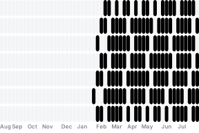
The example uses binTimeX with D3's utcDay interval and an explicit twelve-month domain. Each output row contains the day interval, the summed token count, the session count, and source lineage. Empty bins become real zero-value days and share one consistent neutral treatment.
Calendar placement is a second, explicit step: utcSunday.count produces the week column and date.getUTCDay() selects the row. A categorical usage scale creates contribution-style levels, while the accessible chart description and cell color explain the zero-to-high usage range. The compact focus tooltip keeps the visible detail to the exact token total and date. Keep all calendar calculations in one time basis—UTC here—to avoid moving events between days around daylight-saving transitions.
Aggregate into quantitative cells
A two-dimensional binned heatmap makes density bounded: the number of rendered cells depends on the chosen grid, not directly on the number of raw points.

Prepare explicit x and y interval endpoints plus the aggregate value. Use thresholds that are stable across comparable views and a color domain that states whether absolute count or normalized density is being shown. See Scales for binning and scale ownership.
Trace levels through a scalar grid
A scalar-grid contour shows where a sampled field crosses chosen values. The input is a regular row-major grid rather than a set of x/y observations.

The optional contour mark accepts the raw grid, dimensions, value channel, and levels. It owns marching-squares topology and structured polygons; the chart definition retains the metric and threshold choices. Keep grid orientation and dimensions explicit when changing the sample window.
Estimate point concentration with density contours
Density contours turn many points into nested level sets. They are useful for revealing cluster shape and overlap when raw dots would occlude one another.

Bandwidth and thresholds change the visible shape. Treat them as analytical parameters, keep them stable for comparisons, and explain them when they affect interpretation. The optional densityContour mark maps the source channels through final scales, owns responsive estimation, and emits structured polygons and holes without case-owned path construction.
Retain local structure with hexagonal bins
Hexagonal bins aggregate nearby points in pixel space and encode each bin's count or statistic. They provide a compact alternative when a rectangular grid would impose stronger horizontal and vertical edges.

Pixel-space binning is responsive work: a changed container changes the spatial layout. The optional hexbin mark owns that resolved-layout step, reducer channels, source lineage, and hexagon scene output without a duplicated scale.
Production checks
- State whether color represents count, proportion, rate, or another aggregate.
- Choose a sequential, diverging, or threshold scale that matches the data semantics.
- Keep missing, zero, and out-of-domain cells visually distinct.
- Add direct labels only when cells remain large enough to read. A labeled ordinal matrix is demonstrated in Themes and Styling.
- Prefer aggregation over rendering an unbounded raw point layer. See Large Data.






'%3e%3cpath%20d='M117.436%20207.036V154.604L118.529%20153.51H129.452L130.545%20154.604V207.036L129.452%20208.13H118.529L117.436%20207.036Z'%20fill='%2305BDBA'/%3e%3cpath%20d='M117.436%2053.5225V1.09339L118.529%200H129.452L130.545%201.09339V53.5225L129.452%2054.6159H118.529L117.436%2053.5225Z'%20fill='%2305BDBA'/%3e%3cpath%20d='M69.9539%20169.238H68.4094L60.6869%20161.512V159.967L78.7201%20141.938L86.8976%20141.942L87.9948%20143.031V151.209L69.9539%20169.238Z'%20fill='%2305BDBA'/%3e%3cpath%20d='M69.9462%2038.8917H68.4017L60.6792%2046.6181V48.1626L78.7124%2066.192L86.8899%2066.1882L87.9871%2065.0986V56.9212L69.9462%2038.8917Z'%20fill='%2305BDBA'/%3e%3cpath%20d='M1.09339%2097.5104H75.3711L76.4645%2098.6038V109.526L75.3711%20110.62H1.09339L0%20109.526V98.6038L1.09339%2097.5104Z'%20fill='%2305BDBA'/%3e%3cpath%20d='M440.999%2097.5104H510.91L512.004%2098.6038V109.526L510.91%20110.62H436.633L435.539%20109.526L439.905%2098.6038L440.999%2097.5104Z'%20fill='%2305BDBA'/%3e%3cpath%20d='M212.056%20108.727L210.963%20109.821H177.079L175.986%20110.914C175.986%20113.101%20178.173%20119.657%20186.916%20119.657C190.196%20119.657%20193.472%20118.564%20194.566%20116.377L195.659%20115.284H208.776L209.869%20116.377C208.776%20122.934%20203.313%20132.774%20186.916%20132.774C168.336%20132.774%20159.589%20119.657%20159.589%20104.357C159.589%2089.0576%20168.332%2075.9408%20185.822%2075.9408C203.313%2075.9408%20212.056%2089.0576%20212.056%20104.357V108.731V108.727ZM195.659%2097.7971C195.659%2096.7037%20194.566%2089.0538%20185.822%2089.0538C177.079%2089.0538%20175.986%2096.7037%20175.986%2097.7971L177.079%2098.8905H194.566L195.659%2097.7971Z'%20fill='%23014847'/%3e%3cpath%20d='M242.66%20115.284C242.66%20117.47%20243.753%20118.564%20245.94%20118.564H255.776L256.87%20119.657V130.587L255.776%20131.681H245.94C236.103%20131.681%20227.36%20127.307%20227.36%20115.284V91.2368L226.266%2090.1434H218.617L217.523%2089.05V78.1199L218.617%2077.0265H226.266L227.36%2075.9332V66.0965L228.453%2065.0031H241.57L242.663%2066.0965V75.9332L243.757%2077.0265H255.78L256.874%2078.1199V89.05L255.78%2090.1434H243.757L242.663%2091.2368V115.284H242.66Z'%20fill='%23014847'/%3e%3cpath%20d='M283.1%20131.681H269.983L268.889%20130.587V56.2636L269.983%2055.1702H283.1L284.193%2056.2636V130.587L283.1%20131.681Z'%20fill='%23014847'/%3e%3cpath%20d='M312.61%2068.2871H299.493L298.399%2067.1937V56.2636L299.493%2055.1702H312.61L313.703%2056.2636V67.1937L312.61%2068.2871ZM312.61%20131.681H299.493L298.399%20130.587V78.1237L299.493%2077.0304H312.61L313.703%2078.1237V130.587L312.61%20131.681Z'%20fill='%23014847'/%3e%3cpath%20d='M363.98%2056.2636V67.1937L362.886%2068.2871H353.05C350.863%2068.2871%20349.769%2069.3805%20349.769%2071.5672V75.9408L350.863%2077.0342H361.793L362.886%2078.1276V89.0576L361.793%2090.151H350.863L349.769%2091.2444V130.591L348.676%20131.684H335.559L334.466%20130.591V91.2444L333.372%2090.151H325.723L324.629%2089.0576V78.1276L325.723%2077.0342H333.372L334.466%2075.9408V71.5672C334.466%2059.5438%20343.209%2055.1702%20353.046%2055.1702H362.882L363.976%2056.2636H363.98Z'%20fill='%23014847'/%3e%3cpath%20d='M404.42%20132.774C400.046%20143.704%20395.677%20150.261%20380.373%20150.261H374.906L373.813%20149.167V138.237L374.906%20137.144H380.373C385.836%20137.144%20386.929%20136.05%20388.023%20132.77V131.677L370.536%2089.05V78.1199L371.63%2077.0265H381.466L382.56%2078.1199L395.677%20115.284H396.77L409.887%2078.1199L410.98%2077.0265H420.817L421.91%2078.1199V89.05L404.424%20132.77L404.42%20132.774Z'%20fill='%23014847'/%3e%3cpath%20d='M135.454%20131.681L134.361%20130.587L134.368%2098.9172C134.368%2093.4541%20132.22%2089.2182%20125.625%2089.0806C122.234%2088.9926%20118.354%2089.0729%20114.209%2089.2488L113.59%2089.8834L113.598%20130.587L112.504%20131.681H99.3913L98.2979%20130.587V77.5388L99.3913%2076.4454L128.901%2076.1778C143.685%2076.1778%20149.668%2086.3356%20149.668%2097.8009V130.587L148.575%20131.681H135.454Z'%20fill='%23014847'/%3e%3c/g%3e%3cdefs%3e%3cclipPath%20id='clip0_235_8'%3e%3crect%20width='512'%20height='208.126'%20fill='white'/%3e%3c/clipPath%3e%3c/defs%3e%3c/svg%3e)
'%3e%3cpath%20d='M117.436%20207.036V154.604L118.529%20153.51H129.452L130.545%20154.604V207.036L129.452%20208.13H118.529L117.436%20207.036Z'%20fill='%2332E6E2'/%3e%3cpath%20d='M117.436%2053.5225V1.09339L118.529%200H129.452L130.545%201.09339V53.5225L129.452%2054.6159H118.529L117.436%2053.5225Z'%20fill='%2332E6E2'/%3e%3cpath%20d='M69.9539%20169.238H68.4094L60.6869%20161.512V159.967L78.7201%20141.938L86.8976%20141.942L87.9948%20143.031V151.209L69.9539%20169.238Z'%20fill='%2332E6E2'/%3e%3cpath%20d='M69.9462%2038.8917H68.4017L60.6792%2046.6181V48.1626L78.7124%2066.192L86.8899%2066.1882L87.9871%2065.0986V56.9212L69.9462%2038.8917Z'%20fill='%2332E6E2'/%3e%3cpath%20d='M1.09339%2097.5104H75.3711L76.4645%2098.6038V109.526L75.3711%20110.62H1.09339L0%20109.526V98.6038L1.09339%2097.5104Z'%20fill='%2332E6E2'/%3e%3cpath%20d='M440.999%2097.5104H510.91L512.004%2098.6038V109.526L510.91%20110.62H436.633L435.539%20109.526L439.905%2098.6038L440.999%2097.5104Z'%20fill='%2332E6E2'/%3e%3cpath%20d='M212.056%20108.727L210.963%20109.821H177.079L175.986%20110.914C175.986%20113.101%20178.173%20119.657%20186.916%20119.657C190.196%20119.657%20193.472%20118.564%20194.566%20116.377L195.659%20115.284H208.776L209.869%20116.377C208.776%20122.934%20203.313%20132.774%20186.916%20132.774C168.336%20132.774%20159.589%20119.657%20159.589%20104.357C159.589%2089.0576%20168.332%2075.9408%20185.822%2075.9408C203.313%2075.9408%20212.056%2089.0576%20212.056%20104.357V108.731V108.727ZM195.659%2097.7971C195.659%2096.7037%20194.566%2089.0538%20185.822%2089.0538C177.079%2089.0538%20175.986%2096.7037%20175.986%2097.7971L177.079%2098.8905H194.566L195.659%2097.7971Z'%20fill='white'/%3e%3cpath%20d='M242.66%20115.284C242.66%20117.47%20243.753%20118.564%20245.94%20118.564H255.776L256.87%20119.657V130.587L255.776%20131.681H245.94C236.103%20131.681%20227.36%20127.307%20227.36%20115.284V91.2368L226.266%2090.1434H218.617L217.523%2089.05V78.1199L218.617%2077.0265H226.266L227.36%2075.9332V66.0965L228.453%2065.0031H241.57L242.663%2066.0965V75.9332L243.757%2077.0265H255.78L256.874%2078.1199V89.05L255.78%2090.1434H243.757L242.663%2091.2368V115.284H242.66Z'%20fill='white'/%3e%3cpath%20d='M283.1%20131.681H269.983L268.889%20130.587V56.2636L269.983%2055.1702H283.1L284.193%2056.2636V130.587L283.1%20131.681Z'%20fill='white'/%3e%3cpath%20d='M312.61%2068.2871H299.493L298.399%2067.1937V56.2636L299.493%2055.1702H312.61L313.703%2056.2636V67.1937L312.61%2068.2871ZM312.61%20131.681H299.493L298.399%20130.587V78.1237L299.493%2077.0304H312.61L313.703%2078.1237V130.587L312.61%20131.681Z'%20fill='white'/%3e%3cpath%20d='M363.98%2056.2636V67.1937L362.886%2068.2871H353.05C350.863%2068.2871%20349.769%2069.3805%20349.769%2071.5672V75.9408L350.863%2077.0342H361.793L362.886%2078.1276V89.0576L361.793%2090.151H350.863L349.769%2091.2444V130.591L348.676%20131.684H335.559L334.466%20130.591V91.2444L333.372%2090.151H325.723L324.629%2089.0576V78.1276L325.723%2077.0342H333.372L334.466%2075.9408V71.5672C334.466%2059.5438%20343.209%2055.1702%20353.046%2055.1702H362.882L363.976%2056.2636H363.98Z'%20fill='white'/%3e%3cpath%20d='M404.42%20132.774C400.046%20143.704%20395.677%20150.261%20380.373%20150.261H374.906L373.813%20149.167V138.237L374.906%20137.144H380.373C385.836%20137.144%20386.929%20136.05%20388.023%20132.77V131.677L370.536%2089.05V78.1199L371.63%2077.0265H381.466L382.56%2078.1199L395.677%20115.284H396.77L409.887%2078.1199L410.98%2077.0265H420.817L421.91%2078.1199V89.05L404.424%20132.77L404.42%20132.774Z'%20fill='white'/%3e%3cpath%20d='M135.454%20131.681L134.361%20130.587L134.368%2098.9172C134.368%2093.4541%20132.22%2089.2182%20125.625%2089.0806C122.234%2088.9926%20118.354%2089.0729%20114.209%2089.2488L113.59%2089.8834L113.598%20130.587L112.504%20131.681H99.3913L98.2979%20130.587V77.5388L99.3913%2076.4454L128.901%2076.1778C143.685%2076.1778%20149.668%2086.3356%20149.668%2097.8009V130.587L148.575%20131.681H135.454Z'%20fill='white'/%3e%3c/g%3e%3cdefs%3e%3cclipPath%20id='clip0_235_26'%3e%3crect%20width='512'%20height='208.126'%20fill='white'/%3e%3c/clipPath%3e%3c/defs%3e%3c/svg%3e)







'%3e%3cpath%20d='M255.264%2025.3765H279.579L297.086%2097.519C300.332%20111.135%20300.976%20119.244%20300.976%20119.244H301.304C301.304%20119.244%20302.435%20111.306%20305.681%2097.519L322.373%2025.3765H349.934L367.599%2097.519C371.003%20111.622%20371.818%20119.244%20371.818%20119.244H372.304C372.304%20119.244%20372.632%20111.622%20375.866%2097.519L392.729%2025.3765H417.043L386.249%20143.717H359.174L340.536%2072.0612C336.646%2056.4997%20336.318%2049.5334%20336.318%2049.5334H335.99C335.99%2049.5334%20335.661%2056.4997%20332.099%2072.0612L314.592%20143.717H286.715L255.264%2025.3765Z'%20fill='white'/%3e%3cpath%20d='M412.984%20100.726C412.984%2073.6509%20430.491%2056.1442%20456.921%2056.1442C483.181%2056.1442%20500.688%2073.6509%20500.688%20100.726C500.688%20127.958%20483.181%20145.635%20456.921%20145.635C430.503%20145.623%20412.984%20127.958%20412.984%20100.726ZM477.99%20100.726C477.99%2083.2189%20469.565%2073.3227%20456.921%2073.3227C443.305%2073.3227%20435.682%2084.3495%20435.682%20100.726C435.682%20118.561%20444.107%20128.445%20456.921%20128.445C470.537%20128.445%20477.99%20117.418%20477.99%20100.726Z'%20fill='white'/%3e%3cpath%20d='M511.545%2057.4711H533.101V73.3609H533.587C537.319%2065.0938%20546.231%2056.8267%20561.464%2056.8267C564.054%2056.8267%20565.683%2057.155%20566.813%2057.4711V79.0263H566.169C566.169%2079.0263%20564.224%2078.3819%20558.875%2078.3819C542.182%2078.3819%20533.101%2088.266%20533.101%20106.745V143.704H511.545V57.4711Z'%20fill='white'/%3e%3cpath%20d='M576.868%2025.3765H598.423V63.3079C598.423%2085.6776%20598.095%2089.7261%20598.095%2089.7261H598.423L630.519%2057.4723H657.424L619.833%2094.7592L663.442%20143.717H637.984L606.532%20108.047L598.423%20115.986V143.705H576.868V25.3765Z'%20fill='white'/%3e%3cpath%20d='M663.757%2084.9796C663.757%2048.5072%20686.455%2024.1923%20720.496%2024.1923C754.537%2024.1923%20777.235%2048.5072%20777.235%2084.9796C777.235%20121.452%20754.537%20145.767%20720.496%20145.767C686.455%20145.767%20663.757%20121.452%20663.757%2084.9796ZM753.722%2084.9796C753.722%2060.1784%20740.434%2043.474%20720.483%2043.474C700.533%2043.474%20687.257%2060.1784%20687.257%2084.9796C687.257%20109.781%20700.545%20126.485%20720.483%20126.485C740.422%20126.485%20753.722%20109.781%20753.722%2084.9796Z'%20fill='white'/%3e%3cpath%20d='M785.488%20104.326H810.131C810.131%20118.271%20819.699%20126.052%20834.288%20126.052C846.603%20126.052%20855.041%20119.888%20855.041%20111.135C855.041%20101.25%20848.561%2098.6488%20827.966%2094.6003C809.158%2090.868%20789.22%2084.5461%20789.22%2059.9029C789.22%2039.3203%20806.727%2023.7587%20833.473%2023.7587C861.35%2023.7587%20878.541%2038.3477%20878.541%2060.3892H853.898C853.898%2049.6906%20845.631%2043.0405%20833.473%2043.0405C821.158%2043.0405%20813.535%2049.0341%20813.535%2057.7875C813.535%2067.0272%20818.884%2070.5893%20835.419%2073.9934C859.892%2079.1847%20880%2081.9323%20880%20109.165C880%20130.745%20861.192%20145.333%20833.473%20145.333C805.268%20145.333%20785.488%20128.957%20785.488%20104.326Z'%20fill='white'/%3e%3cpath%20d='M0%2084.0003C0%2087.6782%200.967855%2091.356%202.83904%2094.5177L36.7785%20153.299C40.2628%20159.299%2045.5537%20164.203%2052.1351%20166.397C65.1044%20170.72%2078.5253%20165.171%2084.9131%20154.073L93.1076%20139.878L60.7813%2084.0003L94.9143%2024.8321L103.109%2010.6369C105.561%206.37836%20108.851%202.89408%20112.723%200.119568H109.174H60.0715C50.8446%200.119568%2042.3275%205.02337%2037.7463%2013.0243L2.83904%2073.483C0.967855%2076.6446%200%2080.3225%200%2084.0003Z'%20fill='white'/%3e%3cpath%20d='M193.571%2083.9997C193.571%2080.3219%20192.603%2076.644%20190.732%2073.4824L156.341%2013.9271C149.953%202.89352%20136.532%20-2.65551%20123.563%201.60305C116.982%203.79685%20111.691%208.70065%20108.206%2014.7013L100.464%2028.0577L132.79%2083.9997L98.6569%20143.168L90.4624%20157.363C88.0105%20161.557%2084.7198%20165.106%2080.8484%20167.88H84.3972H133.5C142.727%20167.88%20151.244%20162.977%20155.825%20154.976L190.732%2094.5171C192.603%2091.3554%20193.571%2087.6776%20193.571%2083.9997Z'%20fill='white'/%3e%3c/g%3e%3cdefs%3e%3cclipPath%20id='clip0_1647_45'%3e%3crect%20width='880'%20height='168'%20fill='white'/%3e%3c/clipPath%3e%3c/defs%3e%3c/svg%3e)


'%3e%3cg%20fill-rule='nonzero'%3e%3cpath%20d='m1099.4%20549.4v-12.5h-21.3l-12.5%2012.5z'%20fill='%23ff8b00'/%3e%3cpath%20d='m1123.4%20518.4h-26.7l-12.6%2012.5h39.3z'%20fill='%2355b2c6'/%3e%3cpath%20d='m1053.2%20561.9%206.4-6.4h21.6v12.5h-28z'%20fill='%23f00'/%3e%3cpath%20d='m1057.9%20543.3h13.8l12.6-12.5h-26.4z'%20fill='%23b4bbbf'/%3e%3cpath%20d='m1042.8%20561.9h10.4l12.4-12.5h-22.8z'%20fill='%23b4bbbf'/%3e%3cpath%20d='m1096.7%20518.4-6.4%206.4h-40.8v-12.5h47.2z'%20fill='%23b4bbbf'/%3e%3cpath%20d='m828.6%20559.7h-19.6l-3.4%208.4h-8.6l18.1-42.4h7.5l18.1%2042.4h-8.7zm-2.7-6.7-7.1-17.3-7.1%2017.3z'%20fill='%23031c4c'/%3e%3cpath%20d='m960.1%20541.3c2.5-3.7%208.8-4.1%2011.4-4.1v7.2c-3.2%200-6.4.1-8.3%201.5s-2.9%203.3-2.9%205.6v16.6h-7.8v-30.9h7.5z'%20fill='%23031c4c'/%3e%3c/g%3e%3cpath%20d='m975.8%20537.2h7.8v30.9h-7.8z'%20fill='%23031c4c'/%3e%3cpath%20d='m975.8%20523.4h7.8v9.2h-7.8z'%20fill='%23031c4c'/%3e%3cpath%20d='m1022.3%20523.4v44.7h-7.5l-.2-4.7c-1.1%201.6-2.5%202.9-4.2%203.9-1.7.9-3.8%201.4-6.2%201.4-2.1%200-4.1-.4-5.8-1.1-1.8-.8-3.4-1.8-4.7-3.2s-2.4-3.1-3.1-5c-.8-1.9-1.1-4.1-1.1-6.5s.4-4.6%201.1-6.6c.8-2%201.8-3.7%203.1-5.1s2.9-2.5%204.7-3.3%203.7-1.2%205.8-1.2c2.4%200%204.4.4%206.1%201.3s3.1%202.1%204.2%203.8v-18.3h7.8zm-16.4%2038.6c2.6%200%204.6-.9%206.2-2.6s2.4-4%202.4-6.8-.8-5-2.4-6.8c-1.6-1.7-3.6-2.6-6.2-2.6-2.5%200-4.6.9-6.1%202.6-1.6%201.7-2.4%204-2.4%206.8s.8%205%202.4%206.7c1.6%201.8%203.6%202.7%206.1%202.7'%20fill='%23031c4c'%20fill-rule='nonzero'/%3e%3cpath%20d='m885.8%20544.2h-19.3v6.7h11c-.3%203.4-1.6%206-3.8%208.1-2.2%202-5%203-8.6%203-2%200-3.9-.4-5.5-1.1-1.7-.7-3.1-1.7-4.3-3.1-1.2-1.3-2.1-2.9-2.8-4.8s-1-3.9-1-6.2.3-4.3%201-6.2c.6-1.9%201.6-3.4%202.8-4.8%201.2-1.3%202.6-2.3%204.3-3.1%201.7-.7%203.5-1.1%205.6-1.1%204.2%200%207.4%201%209.6%203l5.2-5.2c-3.9-3-8.9-4.6-14.8-4.6-3.3%200-6.3.5-9%201.6s-5%202.5-6.9%204.4-3.4%204.2-4.4%206.9-1.5%205.7-1.5%208.9.5%206.2%201.6%208.9%202.5%205%204.4%206.9%204.2%203.4%206.9%204.4c2.7%201.1%205.7%201.6%208.9%201.6s6.1-.5%208.7-1.6%204.8-2.5%206.6-4.4%203.2-4.2%204.2-6.9%201.5-5.7%201.5-8.9v-1.3c-.3-.2-.4-.7-.4-1.1'%20fill='%23031c4c'%20fill-rule='nonzero'/%3e%3cpath%20d='m946.8%20544.2h-19.3v6.7h11c-.3%203.4-1.6%206-3.8%208.1-2.2%202-5%203-8.6%203-2%200-3.9-.4-5.5-1.1-1.7-.7-3.1-1.7-4.3-3.1-1.2-1.3-2.1-2.9-2.8-4.8s-1-3.9-1-6.2.3-4.3%201-6.2c.6-1.9%201.6-3.4%202.8-4.8%201.2-1.3%202.6-2.3%204.3-3.1%201.7-.7%203.5-1.1%205.6-1.1%204.2%200%207.4%201%209.6%203l5.2-5.2c-3.9-3-8.9-4.6-14.8-4.6-3.3%200-6.3.5-9%201.6s-5%202.5-6.9%204.4-3.4%204.2-4.4%206.9-1.5%205.7-1.5%208.9.5%206.2%201.6%208.9%202.5%205%204.4%206.9%204.2%203.4%206.9%204.4c2.7%201.1%205.7%201.6%208.9%201.6s6.1-.5%208.7-1.6%204.8-2.5%206.6-4.4%203.2-4.2%204.2-6.9%201.5-5.7%201.5-8.9v-1.3c-.3-.2-.4-.7-.4-1.1'%20fill='%23031c4c'%20fill-rule='nonzero'/%3e%3c/g%3e%3c/svg%3e)
'%3e%3cg%20fill-rule='nonzero'%3e%3cpath%20d='m1099.4%20549.4v-12.5h-21.3l-12.5%2012.5z'%20fill='%23ff8b00'/%3e%3cpath%20d='m1123.4%20518.4h-26.7l-12.6%2012.5h39.3z'%20fill='%2355b2c6'/%3e%3cpath%20d='m1053.2%20561.9%206.4-6.4h21.6v12.5h-28z'%20fill='%23f00'/%3e%3cpath%20d='m1057.9%20543.3h13.8l12.6-12.5h-26.4z'%20fill='%23b4bbbf'/%3e%3cpath%20d='m1042.8%20561.9h10.4l12.4-12.5h-22.8z'%20fill='%23b4bbbf'/%3e%3cpath%20d='m1096.7%20518.4-6.4%206.4h-40.8v-12.5h47.2z'%20fill='%23b4bbbf'/%3e%3cpath%20d='m828.6%20559.7h-19.6l-3.4%208.4h-8.6l18.1-42.4h7.5l18.1%2042.4h-8.7zm-2.7-6.7-7.1-17.3-7.1%2017.3z'%20fill='%23fff'/%3e%3cpath%20d='m960.1%20541.3c2.5-3.7%208.8-4.1%2011.4-4.1v7.2c-3.2%200-6.4.1-8.3%201.5s-2.9%203.3-2.9%205.6v16.6h-7.8v-30.9h7.5z'%20fill='%23fff'/%3e%3c/g%3e%3cpath%20d='m975.8%20537.2h7.8v30.9h-7.8z'%20fill='%23fff'/%3e%3cpath%20d='m975.8%20523.4h7.8v9.2h-7.8z'%20fill='%23fff'/%3e%3cpath%20d='m1022.3%20523.4v44.7h-7.5l-.2-4.7c-1.1%201.6-2.5%202.9-4.2%203.9-1.7.9-3.8%201.4-6.2%201.4-2.1%200-4.1-.4-5.8-1.1-1.8-.8-3.4-1.8-4.7-3.2s-2.4-3.1-3.1-5c-.8-1.9-1.1-4.1-1.1-6.5s.4-4.6%201.1-6.6c.8-2%201.8-3.7%203.1-5.1s2.9-2.5%204.7-3.3%203.7-1.2%205.8-1.2c2.4%200%204.4.4%206.1%201.3s3.1%202.1%204.2%203.8v-18.3h7.8zm-16.4%2038.6c2.6%200%204.6-.9%206.2-2.6s2.4-4%202.4-6.8-.8-5-2.4-6.8c-1.6-1.7-3.6-2.6-6.2-2.6-2.5%200-4.6.9-6.1%202.6-1.6%201.7-2.4%204-2.4%206.8s.8%205%202.4%206.7c1.6%201.8%203.6%202.7%206.1%202.7'%20fill='%23fff'%20fill-rule='nonzero'/%3e%3cpath%20d='m885.8%20544.2h-19.3v6.7h11c-.3%203.4-1.6%206-3.8%208.1-2.2%202-5%203-8.6%203-2%200-3.9-.4-5.5-1.1-1.7-.7-3.1-1.7-4.3-3.1-1.2-1.3-2.1-2.9-2.8-4.8s-1-3.9-1-6.2.3-4.3%201-6.2c.6-1.9%201.6-3.4%202.8-4.8%201.2-1.3%202.6-2.3%204.3-3.1%201.7-.7%203.5-1.1%205.6-1.1%204.2%200%207.4%201%209.6%203l5.2-5.2c-3.9-3-8.9-4.6-14.8-4.6-3.3%200-6.3.5-9%201.6s-5%202.5-6.9%204.4-3.4%204.2-4.4%206.9-1.5%205.7-1.5%208.9.5%206.2%201.6%208.9%202.5%205%204.4%206.9%204.2%203.4%206.9%204.4c2.7%201.1%205.7%201.6%208.9%201.6s6.1-.5%208.7-1.6%204.8-2.5%206.6-4.4%203.2-4.2%204.2-6.9%201.5-5.7%201.5-8.9v-1.3c-.3-.2-.4-.7-.4-1.1'%20fill='%23fff'%20fill-rule='nonzero'/%3e%3cpath%20d='m946.8%20544.2h-19.3v6.7h11c-.3%203.4-1.6%206-3.8%208.1-2.2%202-5%203-8.6%203-2%200-3.9-.4-5.5-1.1-1.7-.7-3.1-1.7-4.3-3.1-1.2-1.3-2.1-2.9-2.8-4.8s-1-3.9-1-6.2.3-4.3%201-6.2c.6-1.9%201.6-3.4%202.8-4.8%201.2-1.3%202.6-2.3%204.3-3.1%201.7-.7%203.5-1.1%205.6-1.1%204.2%200%207.4%201%209.6%203l5.2-5.2c-3.9-3-8.9-4.6-14.8-4.6-3.3%200-6.3.5-9%201.6s-5%202.5-6.9%204.4-3.4%204.2-4.4%206.9-1.5%205.7-1.5%208.9.5%206.2%201.6%208.9%202.5%205%204.4%206.9%204.2%203.4%206.9%204.4c2.7%201.1%205.7%201.6%208.9%201.6s6.1-.5%208.7-1.6%204.8-2.5%206.6-4.4%203.2-4.2%204.2-6.9%201.5-5.7%201.5-8.9v-1.3c-.3-.2-.4-.7-.4-1.1'%20fill='%23fff'%20fill-rule='nonzero'/%3e%3c/g%3e%3c/svg%3e)







'/%3e%3c/svg%3e)
'/%3e%3c/svg%3e)