Facets and Multiple Views
Facets repeat one encoding across groups. Multiple-view compositions place different but related encodings together. Both reduce the amount of data one plot must carry, but they answer different questions.
Use facets when every panel has the same role. Use distinct linked views when one panel provides context, a marginal distribution, controls, or detail for another.
Choose the layout
| Reader question | Start with |
|---|---|
| How does the same distribution differ across cohorts? | Shared-scale facets |
| How does a bivariate relationship relate to each marginal shape? | Scatterplot with marginal histograms |
| Which portion of a long time domain should the detail view show? | Focus-plus-context views |
| Must every group use a different scale or mark composition? | Independent named chart views |
| Should selecting one view filter or highlight another? | Linked views with shared application state |
Faceting and Composition owns the implementation boundary. This page helps choose a layout and verify its comparison semantics.
Repeat one encoding by group
Faceted distributions give each cohort its own panel while preserving a common binning and positional scale. The reader can compare both local shape and absolute position without decoding overlapping fills.

Use shared domains when position should be directly comparable. Independent domains can make local variation easier to see, but they can also exaggerate small differences. If independent scales are intentional, give panels their own guides and state the policy.
Keep the denominator visible by grouping both transforms:
const bins = normalize(
  binX(rows, {
    value: 'body_mass_g',
    by: 'species',
    thresholds,
    outputs: { count: { reduce: 'count' } },
  }),
  {
    value: 'count',
    by: 'species',
    basis: 'sum',
    as: 'proportion',
  },
)
binX owns aggregate lineage and normalize divides each species by its own count. Omit the second by only when the global population is the intended denominator.
Add marginal context
A scatterplot with marginal histograms combines three roles:
- The central plot shows the joint relationship.
- The top histogram shows the x distribution.
- The side histogram shows the y distribution.
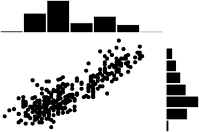
All regions can derive from the same raw observations, but they do not share the same marks or plot rectangle. This example uses public binX and binY transforms inside three ordinary chart definitions. Place them with composeViews and grid, then use shareX and shareY to match the scatterplot's resolved scales and plot ranges. viewGrid is concise syntax for the same non-overlapping layout.
Use separate chart hosts when each view needs independent interaction or an independent accessible label. See View Composition for the single-figure layout contract.
Overlay a summary
An inset can use a different coordinate system from the chart behind it. This places a donut summary over a Cartesian detail chart without teaching either child about the other:
import { composeViews, fill, inset, layer } from '@tanstack/charts/view'

const definition = composeViews({
  views: {
    detail: detailDefinition,
    summary: donutDefinition,
  },
  layout: layer(
    fill('detail'),
    inset('summary', {
      relativeTo: 'detail',
      anchor: 'top-right',
      width: 160,
      height: 160,
      offset: 12,
    }),
  ),
})
The inset is anchored to the complete detail frame. It is clipped to its own frame and shrinks proportionally when the host is too small. Because the child scenes share one outer interaction model, empty inset space and the donut hole leave detail geometry behind them eligible for focus.
Pair detail with context
A focus-plus-context layout uses a compact overview to control the explicit domain of a larger detail chart. The selection is semantic application state, not a rectangle stored inside one renderer.
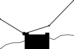
The overview should retain the complete domain. The detail should receive the selected start and end as its configured scale domain. Pointer, touch, and keyboard controls should update the same semantic values, and those values should survive data revisions and resizes.
See Interactions and Selections for controlled brushes, zoom, and linked state.
Coordinate views by values, not pixels
Shared selection, cursor, category, or domain state belongs in the application:
- A view emits a semantic value through focus, selection, or a controlled gesture.
- Application state validates and stores that value.
- Each view derives its own definition and configured scales.
- Each chart compiles a new scene through its normal update path.
Do not query one SVG for a pixel and apply that pixel directly to another view. Different margins, widths, orientations, and scales can represent the same semantic value at different coordinates.
For focus-driven cursors, createChartCursor provides that application-owned state without an overlay or callback relay:
import { createChartCursor, cursorHost } from '@tanstack/charts/cursor'

const sharedDate = createChartCursor<Date, number>()
const cursor = {
  use: cursorHost,
  controller: sharedDate,
  mode: 'focus' as const,
  match: 'x' as const,
  pin: true,
}

const current = defineChart(currentSpec, { cursor })
const previous = defineChart(previousSpec, { cursor })
Pointer, responder, keyboard, or accessibility focus in either browser or React Native chart stores the semantic date. Every subscriber maps that date through its own x scale, resolves its local focus group, and paints its own crosshair({ y: false }). Widths, margins, and y domains can differ. A pinned cursor remains shared until another activation, an escape action, or a programmatic clear dismisses it.
Use anchor: 'value' when setting a controller programmatically for semantic sync. Normalized or scene anchors intentionally share relative or local pixel coordinates instead.
Production checks
- Use one repeated encoding for true facets; use named views when roles differ.
- Place every named composed view exactly once.
- Make shared versus independent domains explicit.
- Keep bin boundaries, group order, color meaning, and units comparable.
- Give each independently interactive view its own accessible label.
- Preserve selection and viewport state across data and size updates.
- Avoid duplicating a full axis on every panel when shared outer guides are accurate.
- Verify panel order at narrow widths in Responsive Charts.
- Provide a table or textual summary when exact cross-panel comparison matters.
For the underlying row and channel model, see Data and Channels.






'%3e%3cpath%20d='M117.436%20207.036V154.604L118.529%20153.51H129.452L130.545%20154.604V207.036L129.452%20208.13H118.529L117.436%20207.036Z'%20fill='%2305BDBA'/%3e%3cpath%20d='M117.436%2053.5225V1.09339L118.529%200H129.452L130.545%201.09339V53.5225L129.452%2054.6159H118.529L117.436%2053.5225Z'%20fill='%2305BDBA'/%3e%3cpath%20d='M69.9539%20169.238H68.4094L60.6869%20161.512V159.967L78.7201%20141.938L86.8976%20141.942L87.9948%20143.031V151.209L69.9539%20169.238Z'%20fill='%2305BDBA'/%3e%3cpath%20d='M69.9462%2038.8917H68.4017L60.6792%2046.6181V48.1626L78.7124%2066.192L86.8899%2066.1882L87.9871%2065.0986V56.9212L69.9462%2038.8917Z'%20fill='%2305BDBA'/%3e%3cpath%20d='M1.09339%2097.5104H75.3711L76.4645%2098.6038V109.526L75.3711%20110.62H1.09339L0%20109.526V98.6038L1.09339%2097.5104Z'%20fill='%2305BDBA'/%3e%3cpath%20d='M440.999%2097.5104H510.91L512.004%2098.6038V109.526L510.91%20110.62H436.633L435.539%20109.526L439.905%2098.6038L440.999%2097.5104Z'%20fill='%2305BDBA'/%3e%3cpath%20d='M212.056%20108.727L210.963%20109.821H177.079L175.986%20110.914C175.986%20113.101%20178.173%20119.657%20186.916%20119.657C190.196%20119.657%20193.472%20118.564%20194.566%20116.377L195.659%20115.284H208.776L209.869%20116.377C208.776%20122.934%20203.313%20132.774%20186.916%20132.774C168.336%20132.774%20159.589%20119.657%20159.589%20104.357C159.589%2089.0576%20168.332%2075.9408%20185.822%2075.9408C203.313%2075.9408%20212.056%2089.0576%20212.056%20104.357V108.731V108.727ZM195.659%2097.7971C195.659%2096.7037%20194.566%2089.0538%20185.822%2089.0538C177.079%2089.0538%20175.986%2096.7037%20175.986%2097.7971L177.079%2098.8905H194.566L195.659%2097.7971Z'%20fill='%23014847'/%3e%3cpath%20d='M242.66%20115.284C242.66%20117.47%20243.753%20118.564%20245.94%20118.564H255.776L256.87%20119.657V130.587L255.776%20131.681H245.94C236.103%20131.681%20227.36%20127.307%20227.36%20115.284V91.2368L226.266%2090.1434H218.617L217.523%2089.05V78.1199L218.617%2077.0265H226.266L227.36%2075.9332V66.0965L228.453%2065.0031H241.57L242.663%2066.0965V75.9332L243.757%2077.0265H255.78L256.874%2078.1199V89.05L255.78%2090.1434H243.757L242.663%2091.2368V115.284H242.66Z'%20fill='%23014847'/%3e%3cpath%20d='M283.1%20131.681H269.983L268.889%20130.587V56.2636L269.983%2055.1702H283.1L284.193%2056.2636V130.587L283.1%20131.681Z'%20fill='%23014847'/%3e%3cpath%20d='M312.61%2068.2871H299.493L298.399%2067.1937V56.2636L299.493%2055.1702H312.61L313.703%2056.2636V67.1937L312.61%2068.2871ZM312.61%20131.681H299.493L298.399%20130.587V78.1237L299.493%2077.0304H312.61L313.703%2078.1237V130.587L312.61%20131.681Z'%20fill='%23014847'/%3e%3cpath%20d='M363.98%2056.2636V67.1937L362.886%2068.2871H353.05C350.863%2068.2871%20349.769%2069.3805%20349.769%2071.5672V75.9408L350.863%2077.0342H361.793L362.886%2078.1276V89.0576L361.793%2090.151H350.863L349.769%2091.2444V130.591L348.676%20131.684H335.559L334.466%20130.591V91.2444L333.372%2090.151H325.723L324.629%2089.0576V78.1276L325.723%2077.0342H333.372L334.466%2075.9408V71.5672C334.466%2059.5438%20343.209%2055.1702%20353.046%2055.1702H362.882L363.976%2056.2636H363.98Z'%20fill='%23014847'/%3e%3cpath%20d='M404.42%20132.774C400.046%20143.704%20395.677%20150.261%20380.373%20150.261H374.906L373.813%20149.167V138.237L374.906%20137.144H380.373C385.836%20137.144%20386.929%20136.05%20388.023%20132.77V131.677L370.536%2089.05V78.1199L371.63%2077.0265H381.466L382.56%2078.1199L395.677%20115.284H396.77L409.887%2078.1199L410.98%2077.0265H420.817L421.91%2078.1199V89.05L404.424%20132.77L404.42%20132.774Z'%20fill='%23014847'/%3e%3cpath%20d='M135.454%20131.681L134.361%20130.587L134.368%2098.9172C134.368%2093.4541%20132.22%2089.2182%20125.625%2089.0806C122.234%2088.9926%20118.354%2089.0729%20114.209%2089.2488L113.59%2089.8834L113.598%20130.587L112.504%20131.681H99.3913L98.2979%20130.587V77.5388L99.3913%2076.4454L128.901%2076.1778C143.685%2076.1778%20149.668%2086.3356%20149.668%2097.8009V130.587L148.575%20131.681H135.454Z'%20fill='%23014847'/%3e%3c/g%3e%3cdefs%3e%3cclipPath%20id='clip0_235_8'%3e%3crect%20width='512'%20height='208.126'%20fill='white'/%3e%3c/clipPath%3e%3c/defs%3e%3c/svg%3e)
'%3e%3cpath%20d='M117.436%20207.036V154.604L118.529%20153.51H129.452L130.545%20154.604V207.036L129.452%20208.13H118.529L117.436%20207.036Z'%20fill='%2332E6E2'/%3e%3cpath%20d='M117.436%2053.5225V1.09339L118.529%200H129.452L130.545%201.09339V53.5225L129.452%2054.6159H118.529L117.436%2053.5225Z'%20fill='%2332E6E2'/%3e%3cpath%20d='M69.9539%20169.238H68.4094L60.6869%20161.512V159.967L78.7201%20141.938L86.8976%20141.942L87.9948%20143.031V151.209L69.9539%20169.238Z'%20fill='%2332E6E2'/%3e%3cpath%20d='M69.9462%2038.8917H68.4017L60.6792%2046.6181V48.1626L78.7124%2066.192L86.8899%2066.1882L87.9871%2065.0986V56.9212L69.9462%2038.8917Z'%20fill='%2332E6E2'/%3e%3cpath%20d='M1.09339%2097.5104H75.3711L76.4645%2098.6038V109.526L75.3711%20110.62H1.09339L0%20109.526V98.6038L1.09339%2097.5104Z'%20fill='%2332E6E2'/%3e%3cpath%20d='M440.999%2097.5104H510.91L512.004%2098.6038V109.526L510.91%20110.62H436.633L435.539%20109.526L439.905%2098.6038L440.999%2097.5104Z'%20fill='%2332E6E2'/%3e%3cpath%20d='M212.056%20108.727L210.963%20109.821H177.079L175.986%20110.914C175.986%20113.101%20178.173%20119.657%20186.916%20119.657C190.196%20119.657%20193.472%20118.564%20194.566%20116.377L195.659%20115.284H208.776L209.869%20116.377C208.776%20122.934%20203.313%20132.774%20186.916%20132.774C168.336%20132.774%20159.589%20119.657%20159.589%20104.357C159.589%2089.0576%20168.332%2075.9408%20185.822%2075.9408C203.313%2075.9408%20212.056%2089.0576%20212.056%20104.357V108.731V108.727ZM195.659%2097.7971C195.659%2096.7037%20194.566%2089.0538%20185.822%2089.0538C177.079%2089.0538%20175.986%2096.7037%20175.986%2097.7971L177.079%2098.8905H194.566L195.659%2097.7971Z'%20fill='white'/%3e%3cpath%20d='M242.66%20115.284C242.66%20117.47%20243.753%20118.564%20245.94%20118.564H255.776L256.87%20119.657V130.587L255.776%20131.681H245.94C236.103%20131.681%20227.36%20127.307%20227.36%20115.284V91.2368L226.266%2090.1434H218.617L217.523%2089.05V78.1199L218.617%2077.0265H226.266L227.36%2075.9332V66.0965L228.453%2065.0031H241.57L242.663%2066.0965V75.9332L243.757%2077.0265H255.78L256.874%2078.1199V89.05L255.78%2090.1434H243.757L242.663%2091.2368V115.284H242.66Z'%20fill='white'/%3e%3cpath%20d='M283.1%20131.681H269.983L268.889%20130.587V56.2636L269.983%2055.1702H283.1L284.193%2056.2636V130.587L283.1%20131.681Z'%20fill='white'/%3e%3cpath%20d='M312.61%2068.2871H299.493L298.399%2067.1937V56.2636L299.493%2055.1702H312.61L313.703%2056.2636V67.1937L312.61%2068.2871ZM312.61%20131.681H299.493L298.399%20130.587V78.1237L299.493%2077.0304H312.61L313.703%2078.1237V130.587L312.61%20131.681Z'%20fill='white'/%3e%3cpath%20d='M363.98%2056.2636V67.1937L362.886%2068.2871H353.05C350.863%2068.2871%20349.769%2069.3805%20349.769%2071.5672V75.9408L350.863%2077.0342H361.793L362.886%2078.1276V89.0576L361.793%2090.151H350.863L349.769%2091.2444V130.591L348.676%20131.684H335.559L334.466%20130.591V91.2444L333.372%2090.151H325.723L324.629%2089.0576V78.1276L325.723%2077.0342H333.372L334.466%2075.9408V71.5672C334.466%2059.5438%20343.209%2055.1702%20353.046%2055.1702H362.882L363.976%2056.2636H363.98Z'%20fill='white'/%3e%3cpath%20d='M404.42%20132.774C400.046%20143.704%20395.677%20150.261%20380.373%20150.261H374.906L373.813%20149.167V138.237L374.906%20137.144H380.373C385.836%20137.144%20386.929%20136.05%20388.023%20132.77V131.677L370.536%2089.05V78.1199L371.63%2077.0265H381.466L382.56%2078.1199L395.677%20115.284H396.77L409.887%2078.1199L410.98%2077.0265H420.817L421.91%2078.1199V89.05L404.424%20132.77L404.42%20132.774Z'%20fill='white'/%3e%3cpath%20d='M135.454%20131.681L134.361%20130.587L134.368%2098.9172C134.368%2093.4541%20132.22%2089.2182%20125.625%2089.0806C122.234%2088.9926%20118.354%2089.0729%20114.209%2089.2488L113.59%2089.8834L113.598%20130.587L112.504%20131.681H99.3913L98.2979%20130.587V77.5388L99.3913%2076.4454L128.901%2076.1778C143.685%2076.1778%20149.668%2086.3356%20149.668%2097.8009V130.587L148.575%20131.681H135.454Z'%20fill='white'/%3e%3c/g%3e%3cdefs%3e%3cclipPath%20id='clip0_235_26'%3e%3crect%20width='512'%20height='208.126'%20fill='white'/%3e%3c/clipPath%3e%3c/defs%3e%3c/svg%3e)









'%3e%3cpath%20d='M255.264%2025.3765H279.579L297.086%2097.519C300.332%20111.135%20300.976%20119.244%20300.976%20119.244H301.304C301.304%20119.244%20302.435%20111.306%20305.681%2097.519L322.373%2025.3765H349.934L367.599%2097.519C371.003%20111.622%20371.818%20119.244%20371.818%20119.244H372.304C372.304%20119.244%20372.632%20111.622%20375.866%2097.519L392.729%2025.3765H417.043L386.249%20143.717H359.174L340.536%2072.0612C336.646%2056.4997%20336.318%2049.5334%20336.318%2049.5334H335.99C335.99%2049.5334%20335.661%2056.4997%20332.099%2072.0612L314.592%20143.717H286.715L255.264%2025.3765Z'%20fill='white'/%3e%3cpath%20d='M412.984%20100.726C412.984%2073.6509%20430.491%2056.1442%20456.921%2056.1442C483.181%2056.1442%20500.688%2073.6509%20500.688%20100.726C500.688%20127.958%20483.181%20145.635%20456.921%20145.635C430.503%20145.623%20412.984%20127.958%20412.984%20100.726ZM477.99%20100.726C477.99%2083.2189%20469.565%2073.3227%20456.921%2073.3227C443.305%2073.3227%20435.682%2084.3495%20435.682%20100.726C435.682%20118.561%20444.107%20128.445%20456.921%20128.445C470.537%20128.445%20477.99%20117.418%20477.99%20100.726Z'%20fill='white'/%3e%3cpath%20d='M511.545%2057.4711H533.101V73.3609H533.587C537.319%2065.0938%20546.231%2056.8267%20561.464%2056.8267C564.054%2056.8267%20565.683%2057.155%20566.813%2057.4711V79.0263H566.169C566.169%2079.0263%20564.224%2078.3819%20558.875%2078.3819C542.182%2078.3819%20533.101%2088.266%20533.101%20106.745V143.704H511.545V57.4711Z'%20fill='white'/%3e%3cpath%20d='M576.868%2025.3765H598.423V63.3079C598.423%2085.6776%20598.095%2089.7261%20598.095%2089.7261H598.423L630.519%2057.4723H657.424L619.833%2094.7592L663.442%20143.717H637.984L606.532%20108.047L598.423%20115.986V143.705H576.868V25.3765Z'%20fill='white'/%3e%3cpath%20d='M663.757%2084.9796C663.757%2048.5072%20686.455%2024.1923%20720.496%2024.1923C754.537%2024.1923%20777.235%2048.5072%20777.235%2084.9796C777.235%20121.452%20754.537%20145.767%20720.496%20145.767C686.455%20145.767%20663.757%20121.452%20663.757%2084.9796ZM753.722%2084.9796C753.722%2060.1784%20740.434%2043.474%20720.483%2043.474C700.533%2043.474%20687.257%2060.1784%20687.257%2084.9796C687.257%20109.781%20700.545%20126.485%20720.483%20126.485C740.422%20126.485%20753.722%20109.781%20753.722%2084.9796Z'%20fill='white'/%3e%3cpath%20d='M785.488%20104.326H810.131C810.131%20118.271%20819.699%20126.052%20834.288%20126.052C846.603%20126.052%20855.041%20119.888%20855.041%20111.135C855.041%20101.25%20848.561%2098.6488%20827.966%2094.6003C809.158%2090.868%20789.22%2084.5461%20789.22%2059.9029C789.22%2039.3203%20806.727%2023.7587%20833.473%2023.7587C861.35%2023.7587%20878.541%2038.3477%20878.541%2060.3892H853.898C853.898%2049.6906%20845.631%2043.0405%20833.473%2043.0405C821.158%2043.0405%20813.535%2049.0341%20813.535%2057.7875C813.535%2067.0272%20818.884%2070.5893%20835.419%2073.9934C859.892%2079.1847%20880%2081.9323%20880%20109.165C880%20130.745%20861.192%20145.333%20833.473%20145.333C805.268%20145.333%20785.488%20128.957%20785.488%20104.326Z'%20fill='white'/%3e%3cpath%20d='M0%2084.0003C0%2087.6782%200.967855%2091.356%202.83904%2094.5177L36.7785%20153.299C40.2628%20159.299%2045.5537%20164.203%2052.1351%20166.397C65.1044%20170.72%2078.5253%20165.171%2084.9131%20154.073L93.1076%20139.878L60.7813%2084.0003L94.9143%2024.8321L103.109%2010.6369C105.561%206.37836%20108.851%202.89408%20112.723%200.119568H109.174H60.0715C50.8446%200.119568%2042.3275%205.02337%2037.7463%2013.0243L2.83904%2073.483C0.967855%2076.6446%200%2080.3225%200%2084.0003Z'%20fill='white'/%3e%3cpath%20d='M193.571%2083.9997C193.571%2080.3219%20192.603%2076.644%20190.732%2073.4824L156.341%2013.9271C149.953%202.89352%20136.532%20-2.65551%20123.563%201.60305C116.982%203.79685%20111.691%208.70065%20108.206%2014.7013L100.464%2028.0577L132.79%2083.9997L98.6569%20143.168L90.4624%20157.363C88.0105%20161.557%2084.7198%20165.106%2080.8484%20167.88H84.3972H133.5C142.727%20167.88%20151.244%20162.977%20155.825%20154.976L190.732%2094.5171C192.603%2091.3554%20193.571%2087.6776%20193.571%2083.9997Z'%20fill='white'/%3e%3c/g%3e%3cdefs%3e%3cclipPath%20id='clip0_1647_45'%3e%3crect%20width='880'%20height='168'%20fill='white'/%3e%3c/clipPath%3e%3c/defs%3e%3c/svg%3e)
'%3e%3cg%20fill-rule='nonzero'%3e%3cpath%20d='m1099.4%20549.4v-12.5h-21.3l-12.5%2012.5z'%20fill='%23ff8b00'/%3e%3cpath%20d='m1123.4%20518.4h-26.7l-12.6%2012.5h39.3z'%20fill='%2355b2c6'/%3e%3cpath%20d='m1053.2%20561.9%206.4-6.4h21.6v12.5h-28z'%20fill='%23f00'/%3e%3cpath%20d='m1057.9%20543.3h13.8l12.6-12.5h-26.4z'%20fill='%23b4bbbf'/%3e%3cpath%20d='m1042.8%20561.9h10.4l12.4-12.5h-22.8z'%20fill='%23b4bbbf'/%3e%3cpath%20d='m1096.7%20518.4-6.4%206.4h-40.8v-12.5h47.2z'%20fill='%23b4bbbf'/%3e%3cpath%20d='m828.6%20559.7h-19.6l-3.4%208.4h-8.6l18.1-42.4h7.5l18.1%2042.4h-8.7zm-2.7-6.7-7.1-17.3-7.1%2017.3z'%20fill='%23031c4c'/%3e%3cpath%20d='m960.1%20541.3c2.5-3.7%208.8-4.1%2011.4-4.1v7.2c-3.2%200-6.4.1-8.3%201.5s-2.9%203.3-2.9%205.6v16.6h-7.8v-30.9h7.5z'%20fill='%23031c4c'/%3e%3c/g%3e%3cpath%20d='m975.8%20537.2h7.8v30.9h-7.8z'%20fill='%23031c4c'/%3e%3cpath%20d='m975.8%20523.4h7.8v9.2h-7.8z'%20fill='%23031c4c'/%3e%3cpath%20d='m1022.3%20523.4v44.7h-7.5l-.2-4.7c-1.1%201.6-2.5%202.9-4.2%203.9-1.7.9-3.8%201.4-6.2%201.4-2.1%200-4.1-.4-5.8-1.1-1.8-.8-3.4-1.8-4.7-3.2s-2.4-3.1-3.1-5c-.8-1.9-1.1-4.1-1.1-6.5s.4-4.6%201.1-6.6c.8-2%201.8-3.7%203.1-5.1s2.9-2.5%204.7-3.3%203.7-1.2%205.8-1.2c2.4%200%204.4.4%206.1%201.3s3.1%202.1%204.2%203.8v-18.3h7.8zm-16.4%2038.6c2.6%200%204.6-.9%206.2-2.6s2.4-4%202.4-6.8-.8-5-2.4-6.8c-1.6-1.7-3.6-2.6-6.2-2.6-2.5%200-4.6.9-6.1%202.6-1.6%201.7-2.4%204-2.4%206.8s.8%205%202.4%206.7c1.6%201.8%203.6%202.7%206.1%202.7'%20fill='%23031c4c'%20fill-rule='nonzero'/%3e%3cpath%20d='m885.8%20544.2h-19.3v6.7h11c-.3%203.4-1.6%206-3.8%208.1-2.2%202-5%203-8.6%203-2%200-3.9-.4-5.5-1.1-1.7-.7-3.1-1.7-4.3-3.1-1.2-1.3-2.1-2.9-2.8-4.8s-1-3.9-1-6.2.3-4.3%201-6.2c.6-1.9%201.6-3.4%202.8-4.8%201.2-1.3%202.6-2.3%204.3-3.1%201.7-.7%203.5-1.1%205.6-1.1%204.2%200%207.4%201%209.6%203l5.2-5.2c-3.9-3-8.9-4.6-14.8-4.6-3.3%200-6.3.5-9%201.6s-5%202.5-6.9%204.4-3.4%204.2-4.4%206.9-1.5%205.7-1.5%208.9.5%206.2%201.6%208.9%202.5%205%204.4%206.9%204.2%203.4%206.9%204.4c2.7%201.1%205.7%201.6%208.9%201.6s6.1-.5%208.7-1.6%204.8-2.5%206.6-4.4%203.2-4.2%204.2-6.9%201.5-5.7%201.5-8.9v-1.3c-.3-.2-.4-.7-.4-1.1'%20fill='%23031c4c'%20fill-rule='nonzero'/%3e%3cpath%20d='m946.8%20544.2h-19.3v6.7h11c-.3%203.4-1.6%206-3.8%208.1-2.2%202-5%203-8.6%203-2%200-3.9-.4-5.5-1.1-1.7-.7-3.1-1.7-4.3-3.1-1.2-1.3-2.1-2.9-2.8-4.8s-1-3.9-1-6.2.3-4.3%201-6.2c.6-1.9%201.6-3.4%202.8-4.8%201.2-1.3%202.6-2.3%204.3-3.1%201.7-.7%203.5-1.1%205.6-1.1%204.2%200%207.4%201%209.6%203l5.2-5.2c-3.9-3-8.9-4.6-14.8-4.6-3.3%200-6.3.5-9%201.6s-5%202.5-6.9%204.4-3.4%204.2-4.4%206.9-1.5%205.7-1.5%208.9.5%206.2%201.6%208.9%202.5%205%204.4%206.9%204.2%203.4%206.9%204.4c2.7%201.1%205.7%201.6%208.9%201.6s6.1-.5%208.7-1.6%204.8-2.5%206.6-4.4%203.2-4.2%204.2-6.9%201.5-5.7%201.5-8.9v-1.3c-.3-.2-.4-.7-.4-1.1'%20fill='%23031c4c'%20fill-rule='nonzero'/%3e%3c/g%3e%3c/svg%3e)
'%3e%3cg%20fill-rule='nonzero'%3e%3cpath%20d='m1099.4%20549.4v-12.5h-21.3l-12.5%2012.5z'%20fill='%23ff8b00'/%3e%3cpath%20d='m1123.4%20518.4h-26.7l-12.6%2012.5h39.3z'%20fill='%2355b2c6'/%3e%3cpath%20d='m1053.2%20561.9%206.4-6.4h21.6v12.5h-28z'%20fill='%23f00'/%3e%3cpath%20d='m1057.9%20543.3h13.8l12.6-12.5h-26.4z'%20fill='%23b4bbbf'/%3e%3cpath%20d='m1042.8%20561.9h10.4l12.4-12.5h-22.8z'%20fill='%23b4bbbf'/%3e%3cpath%20d='m1096.7%20518.4-6.4%206.4h-40.8v-12.5h47.2z'%20fill='%23b4bbbf'/%3e%3cpath%20d='m828.6%20559.7h-19.6l-3.4%208.4h-8.6l18.1-42.4h7.5l18.1%2042.4h-8.7zm-2.7-6.7-7.1-17.3-7.1%2017.3z'%20fill='%23fff'/%3e%3cpath%20d='m960.1%20541.3c2.5-3.7%208.8-4.1%2011.4-4.1v7.2c-3.2%200-6.4.1-8.3%201.5s-2.9%203.3-2.9%205.6v16.6h-7.8v-30.9h7.5z'%20fill='%23fff'/%3e%3c/g%3e%3cpath%20d='m975.8%20537.2h7.8v30.9h-7.8z'%20fill='%23fff'/%3e%3cpath%20d='m975.8%20523.4h7.8v9.2h-7.8z'%20fill='%23fff'/%3e%3cpath%20d='m1022.3%20523.4v44.7h-7.5l-.2-4.7c-1.1%201.6-2.5%202.9-4.2%203.9-1.7.9-3.8%201.4-6.2%201.4-2.1%200-4.1-.4-5.8-1.1-1.8-.8-3.4-1.8-4.7-3.2s-2.4-3.1-3.1-5c-.8-1.9-1.1-4.1-1.1-6.5s.4-4.6%201.1-6.6c.8-2%201.8-3.7%203.1-5.1s2.9-2.5%204.7-3.3%203.7-1.2%205.8-1.2c2.4%200%204.4.4%206.1%201.3s3.1%202.1%204.2%203.8v-18.3h7.8zm-16.4%2038.6c2.6%200%204.6-.9%206.2-2.6s2.4-4%202.4-6.8-.8-5-2.4-6.8c-1.6-1.7-3.6-2.6-6.2-2.6-2.5%200-4.6.9-6.1%202.6-1.6%201.7-2.4%204-2.4%206.8s.8%205%202.4%206.7c1.6%201.8%203.6%202.7%206.1%202.7'%20fill='%23fff'%20fill-rule='nonzero'/%3e%3cpath%20d='m885.8%20544.2h-19.3v6.7h11c-.3%203.4-1.6%206-3.8%208.1-2.2%202-5%203-8.6%203-2%200-3.9-.4-5.5-1.1-1.7-.7-3.1-1.7-4.3-3.1-1.2-1.3-2.1-2.9-2.8-4.8s-1-3.9-1-6.2.3-4.3%201-6.2c.6-1.9%201.6-3.4%202.8-4.8%201.2-1.3%202.6-2.3%204.3-3.1%201.7-.7%203.5-1.1%205.6-1.1%204.2%200%207.4%201%209.6%203l5.2-5.2c-3.9-3-8.9-4.6-14.8-4.6-3.3%200-6.3.5-9%201.6s-5%202.5-6.9%204.4-3.4%204.2-4.4%206.9-1.5%205.7-1.5%208.9.5%206.2%201.6%208.9%202.5%205%204.4%206.9%204.2%203.4%206.9%204.4c2.7%201.1%205.7%201.6%208.9%201.6s6.1-.5%208.7-1.6%204.8-2.5%206.6-4.4%203.2-4.2%204.2-6.9%201.5-5.7%201.5-8.9v-1.3c-.3-.2-.4-.7-.4-1.1'%20fill='%23fff'%20fill-rule='nonzero'/%3e%3cpath%20d='m946.8%20544.2h-19.3v6.7h11c-.3%203.4-1.6%206-3.8%208.1-2.2%202-5%203-8.6%203-2%200-3.9-.4-5.5-1.1-1.7-.7-3.1-1.7-4.3-3.1-1.2-1.3-2.1-2.9-2.8-4.8s-1-3.9-1-6.2.3-4.3%201-6.2c.6-1.9%201.6-3.4%202.8-4.8%201.2-1.3%202.6-2.3%204.3-3.1%201.7-.7%203.5-1.1%205.6-1.1%204.2%200%207.4%201%209.6%203l5.2-5.2c-3.9-3-8.9-4.6-14.8-4.6-3.3%200-6.3.5-9%201.6s-5%202.5-6.9%204.4-3.4%204.2-4.4%206.9-1.5%205.7-1.5%208.9.5%206.2%201.6%208.9%202.5%205%204.4%206.9%204.2%203.4%206.9%204.4c2.7%201.1%205.7%201.6%208.9%201.6s6.1-.5%208.7-1.6%204.8-2.5%206.6-4.4%203.2-4.2%204.2-6.9%201.5-5.7%201.5-8.9v-1.3c-.3-.2-.4-.7-.4-1.1'%20fill='%23fff'%20fill-rule='nonzero'/%3e%3c/g%3e%3c/svg%3e)





'/%3e%3c/svg%3e)
'/%3e%3c/svg%3e)